
Bitcoin PAI
Bitcoin PAI (Power Amplitude Index) & Probability Outlook
The Power Amplitude Index (PAI) measures where Bitcoin’s price sits relative to its own historical behavior. Instead of attempting to forecast direction directly, PAI gives us context: it shows whether price is currently cheap, normal, or expensive relative to long-term market structure.
This matters because execution timing—not prediction—determines long‑run outcomes. PAI helps avoid chasing tops or selling bottoms by grounding decision-making in statistical historical regimes.
Understanding the PAI Scale
| PAI Range | Interpretation | Typical Market Behavior |
|---|---|---|
| 0.0 – 0.2 | Historically Cheap | Accumulation and long-term value entry zones |
| 0.4 – 0.6 | Neutral / Mid-Range | Sideways drift, consolidation, indecision |
| 0.8 – 1.0 | Historically Expensive | Distribution behavior and increased reversal probability |
PAI is engineered with no look‑ahead bias. It never references future price when computing current values, which preserves causality and ensures reliability when applied forward.
Current Bitcoin Positioning
Bitcoin’s current PAI level indicates the broader regime and how the market is behaving relative to long-term historical structure.
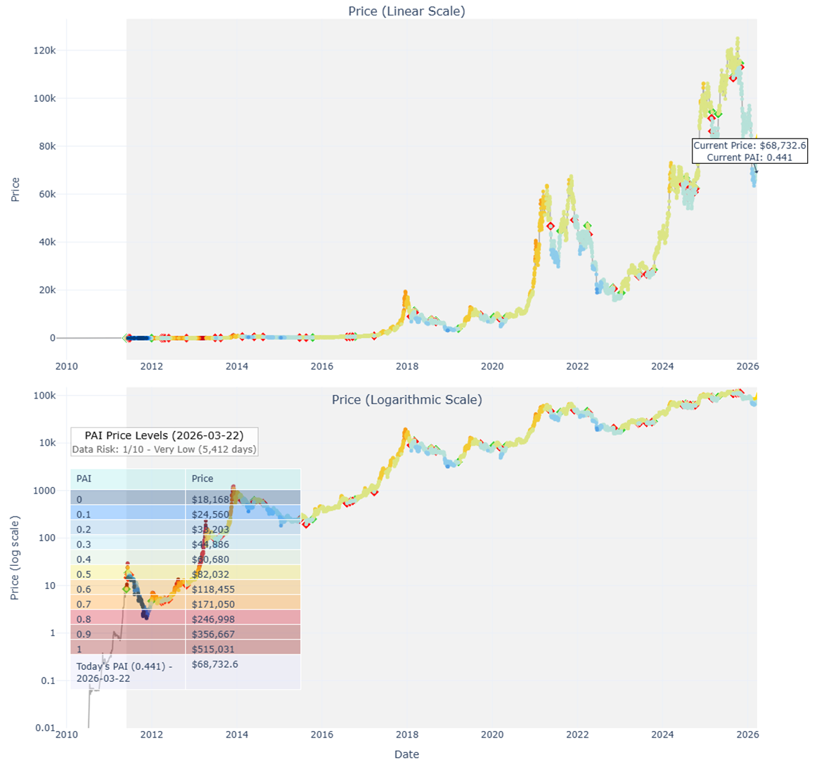
How to Read the Chart Above
This composite chart includes:
- Price Colored by PAI — indicates where current price sits relative to historical valuation.
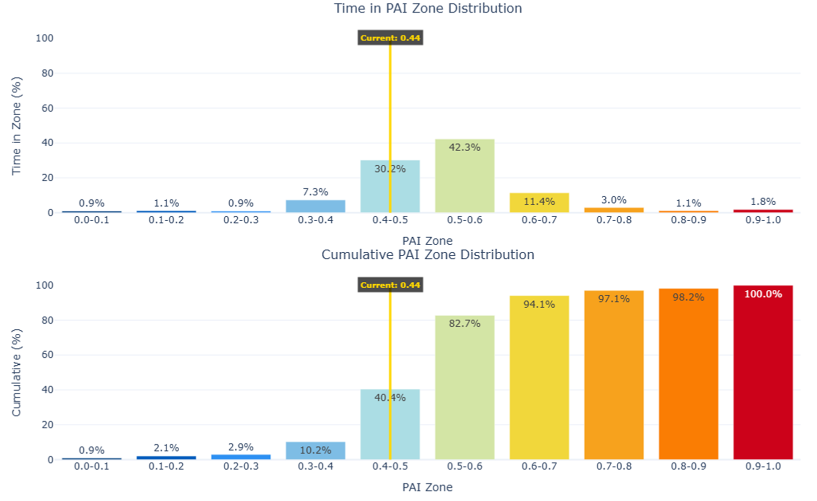
- Time in Zone Distribution — shows how often Bitcoin revisits each valuation region.
- Cumulative Zone Behavior — provides structural depth of each regime.
- Touch Probability Forecasts (30 / 60 / 90 Days) — show probabilities, not predictions.
This gives us a probabilistic weather report:
Not where price will go — but where the conditions favor accumulation, neutrality, or risk management.
Probability Outlook (30 / 60 / 90 Days)
The key actionable component is the touch probability forecast, showing the likelihood of Bitcoin interacting with specific price/PAI zones within set time windows.
Because Bitcoin has deep history and high market efficiency, the model for BTC achieves very strong calibration (Brier Score ~0.05).
This is professional‑grade forecasting performance.
Interpretation
- The probability of Bitcoin touching higher PAI regions (e.g., expansion toward cycle‑continuation levels) is currently higher than the probability of revisiting deep value zones.
- Over 60–90 day windows, the probabilistic weight is skewed upward.
- Dips during this phase are generally noise, not structural trend shifts.
Execution Principle:
Maintain core exposure. View pullbacks as opportunities to accumulate rather than reduce exposure.
Practical Positioning Framework
| Market Condition | Expected Market Dynamics | Best Action |
|---|---|---|
| PAI 0.0–0.2 | Structural undervaluation | Scale in / accumulate |
| PAI 0.3–0.6 | Neutral drift | Hold positioning |
| PAI 0.7–1.0 | Overextension / distribution | Trim or risk manage |
This is not predictive trading.
This is probabilistic execution discipline.
How This Fits Into the Larger Framework
PAI provides local execution context.
The Bitcoin Power Law provides macro‑cycle context.
| Model | Role |
|---|---|
| Power Law | Determines long-term structural cycle trajectory |
| PAI | Determines near‑term execution and positioning quality |
To see how these work together:
https://powerlawinvestor.com/pai-guide/
Get Weekly Updated Probability Dashboards
If you want updated Bitcoin, Kaspa, and Fartcoin probability distributions each week:
Get the Weekly Probability Dashboard (Free):
https://powerlawinvestor.com/